Jules Ackleow
UX Designer
I am a UX Generalist with experience in UX research, UI design, prototyping, and product design for SaaS (Software as a Service) products. My coding knowledge fosters empathy with developers and an understanding of technical and design constraints.I care about what people want and need; so, by putting people first in my design decisions, I make products that people want to use.
Resume
Experience
UX Designer
Jobvite / Remote / March 2021 - Present
Collaborates with multi-disciplinary teams to enhance the usability and visually refresh the app.
Collaborates with the UX team on creating and maintaining the company's design system.
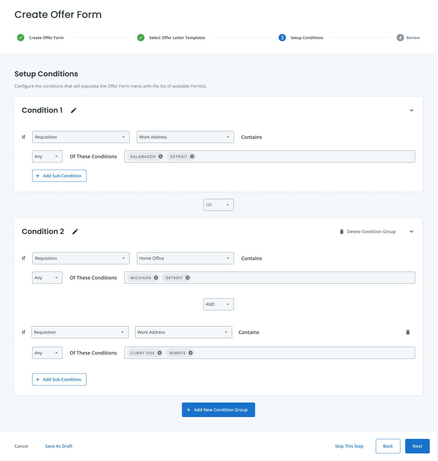
Designed a criteria engine used to generate offer letters with conditions.
Led a research project for the candidate management project to gain more insight into how the users manage candidates.
Key Achievements:
- Helped increase 15-20% in sales for enhancing the usability of the app through visual and usability refresh projects.
- Customer delight in criteria engine feature. Helped reduce churn from companies that needed this feature but didn't have it before.
- Built and managed the company's internal design system which increased productivity and consistency.
Technical Support Specialist (Level 2)
Jobvite / Remote / September 2018 - March 2021
Provided subject matter expertise on Candidate Recruitment Marketing as part of a "Center of Excellence".
Provided customer support for more complex or higher-level technical issues while using the product.
Performed screenshares with customers, investigated API issues, coordinated with the engineering team on deeper issues, monitored live channels, and created documentation for training purposes.
Managed case tickets and triaged cases, provisioned new products for customers, and other operational tasks.
Key Achievements:
- Quicker turnaround time for cases as I was able to provide live help, and reduced the time it took to get to a case.
- Consistent high scores in customer satisfaction surveys and NPS.
Technical Support Representative (Level 1)
First Call Resolution-Jobvite / Coos Bay, OR / October 2017 – August 2018
Provided customer support for the Jobvite suite of talent acquisition software. Consistently helped customers troubleshoot and solve their cases effectively and successfully.
Provided live assistance with customers via phone calls, and live chats.
Trained new employees whenever necessary.
Key Achievements:
- Consistently helped customers with their cases successfully, which then resulted in 5-star reviews on my performance.
- I was quickly promoted to Level 2.
Professional Affiliations
Active committee member for the Employ Diversity, Equity, & Inclusion (DE&I) committee at Jobvite.
Active and contributing member of several Employee Resource Groups (ERG) at Jobvite.
UXPA (User Experience Professionals Association).
Golden Key International Honour Society.
Education
M.S. in Human Computer Interaction
Indiana University Purdue University Indianapolis (IUPUI)
GPA: 3.90
Graduated, 2020 - 2023
B.S. in Informatics
Indiana University Purdue University Indianapolis (IUPUI)
Minor: Computer Science
Certificate: Human Computer Interaction
GPA: 3.63, with Distinction
Graduated, 2015 - 2020
Bachelor of Languages and Linguistics (Hons.)
University of Malaya, Malaysia
GPA: 3.78, with Honors
Graduated, 2005-2008
Tools & Skills
Technologies
Figma
Adobe XD
Miro
Git
JIRA
UX Skills
Accessibility best practices
Affinity diagramming
Competitive analysis
Conducting user interviews
Contextual inquiry
Design thinking
Ethnography/Field research
Heuristic evaluation
Interaction design
Journey mapping
Persona creation
Storyboarding
Surveys
Task analysis
Usability testing (qualitative and quantitative)
Wireframing and prototyping
Programming Skills
JavaScript (Intermediate)
HTML/CSS (Intermediate)
Python (Rookie)
Java (Rookie)
Criteria Engine for ATS
This project was completed for the Applicant Tracking System at Jobvite. Project Date: July 2021 - May 2022
My Role
Primary contributor within a UX team of 5.
Summary
Jobvite is a cloud-based tool simplifying employee recruitment for companies. It includes features like an Applicant Tracking System (ATS) Candidate Relationship Management (CRM), and data analytics to enhance the hiring process and effectively manage applicants.In May 2022, we implemented a new feature within the ATS called the 'criteria engine'. It automatically selects the appropriate job offer letter template based on user-entered information.This feature secured the renewal of an enterprise customer's ATS subscription, showcasing its value. The positive outcome highlighted effective collaboration between UX, Product, and Engineering teams, which emphasizes that cohesive teamwork results in products that improved user experience.Here is a clickable prototype of this feature - please note that this prototype was build as a linear progression from a specific set of conditions and input:
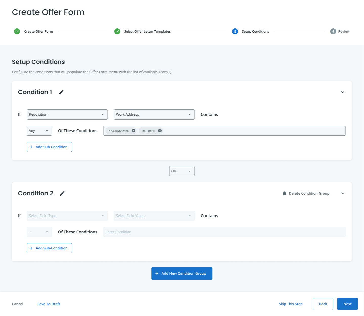
The following are screenshots of the end product of the feature:

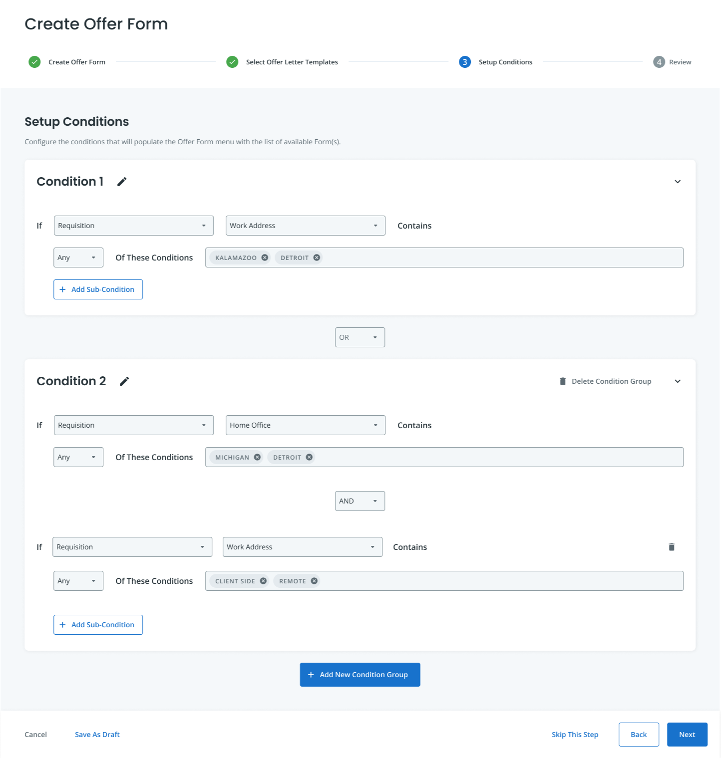
Final Product - Screen with all conditions entered.

Example of screen where the user enters the conditions.
Context
In the applicant tracking system (ATS), administrators can create customized offer letter templates for job offers. As different locations and job titles come with unique regulations and living costs, a one-size-fits-all approach isn't sufficient.Administrators needed an automated system to select the appropriate template when a hiring manager or recruiter decides to extend a job offer. Introducing the criteria engine feature allowed users to generate multiple templates tailored to specific jobs or locations. This feature ensures that the system automatically selects the right template based on predefined conditions.
User Goals
"As an admin of a nationwide retail company, I want to enable my recruiters to pick the right offer templates because laws and conditions for each state are different. I want to be able to set up rules to filter the right offer letter template for my recruiters."
Process
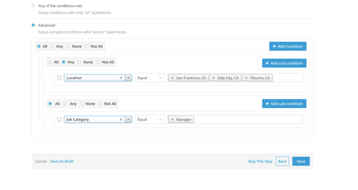
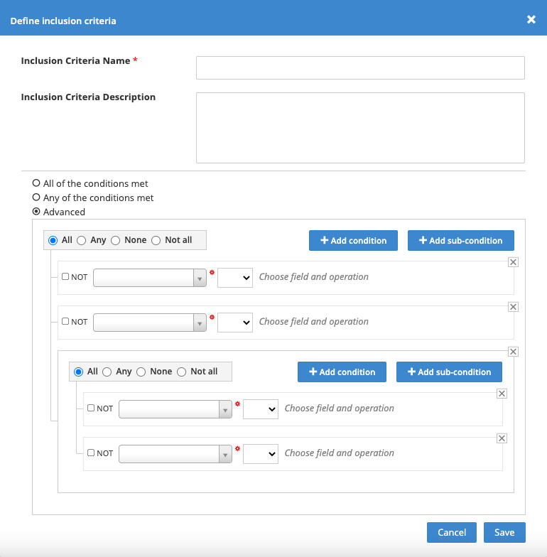
Initially, the Project Manager suggested utilizing the "inclusion criteria" method from the Onboarding system for automated task assignments. While this could reduce back-end work, I identified a few issues that wouldn't be suitable for this project:
Different Use Cases: The Onboarding system and the ATS serve distinct purposes. The Onboarding system manages new hires while the ATS manages candidates using separate candidate/new hire accounts.
Complexity Concern: Examining the Onboarding system's method for creating conditions revealed a high level of complexity. Additional rules or conditions cluttered the screen, resembling a confusing web of lines and boxes; particularly challenging for non-experts to navigate and understand.
Usability Challenge: The tool required users, including those with limited technical or computer logic knowledge, to grasp terms like "All," "Any," "None," along with AND, NOT, and OR to establish rules. Any errors or contradictory rules could disrupt the system, posing potential problems.

Screenshot of the inclusion criteria feature from Onboarding

Another example of the inclusion criteria feature from Onboarding
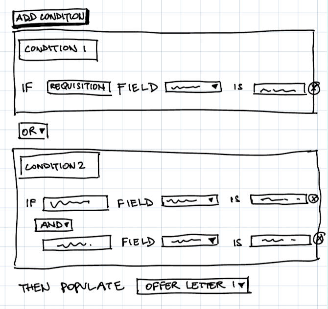
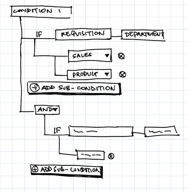
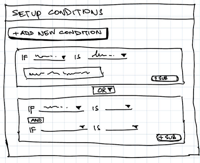
Following the review, I conducted a competitive analysis where I discovered that organizing rules in a tree-like structure, akin to computer folders, enhances clarity and organization. Leveraging this insight, I sketched out a plan to use the tree structure pattern to propose a more effective rule management solution.

Sketch of Idea in groups as a card grouping.

Sketch of Idea in groups as a tree grid structure.

Sketch of Idea in groups in a modal.
I suggested simplifying the criteria engine for users by using everyday language instead of technical terms. Rather than displaying all the rules simultaneously, I proposed guiding users through setting up one rule at a time. The system would hide irrelevant information, making it less confusing and allowing users to focus on each step before proceeding.We refined this concept, gathered feedback from stakeholders and the engineering team, and, once everyone was on board, I created a high-fidelity prototype (I used our own internal design system that matches the look and feel of the current app). This plan was then handed over to the engineering team for implementation.

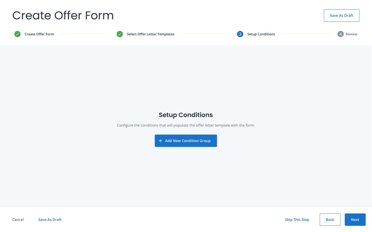
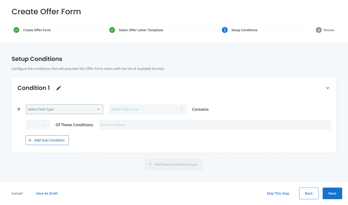
Empty state - landing page

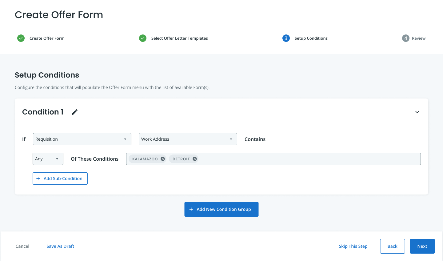
When adding a new condition, the system progressively discloses the information the user needs.

A view of the screen with some values entered.

Final screen with all conditions added.
What I Learned
The project received positive feedback from the internal users who found it much easier and time-saving to create offer letters with multiple conditions and understand the rules they needed. This is especially helpful for enterprise level companies that hire lots of people at a time.
The feature was launched for General Access in August 2022, resulting in convincing a customer to stay, and winning over Guitar Center, enabling them to create 50 different offer letters for various store locations.
Post-launch, the UX team garnered support from the PM, who appreciated the user-centric approach instead of the quickest approach.
We think we can make the feature even better by adding a "preview" page, so the admin can see what the recruiters will see when they pick an offer letter.
This project, one of my first at Jobvite, taught me effective PM management, iterative design based on feedback, and the value of collaborative efforts with PM and engineering teams for an optimal user experience.
Dungeons & Dragons Character Builder
This was a final project that I had completed for an undergraduate-level class called "Usability Principles for New Media Interfaces." - Completed in the Fall 2018 Semester
My Role
Primary contributor (solo project).
Summary
Imagine quickly diving into a Dungeons and Dragons (D&D) game after effortlessly creating your character with just a few tweaks on an app. This is an appealing idea for tabletop RPG (role playing game) players who often find character creation challenging. Existing online character builders often require extensive data input and assume players have a deep understanding of the rules and lore."D&D Character Creator" aims to address this issue by providing a solution that allows players to easily craft custom characters without the need to navigate complex handbooks or possess in-depth knowledge of D&D lore.

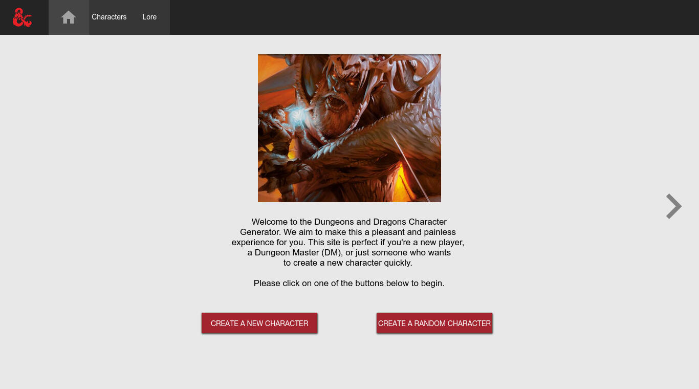
Screenshot of the landing page.

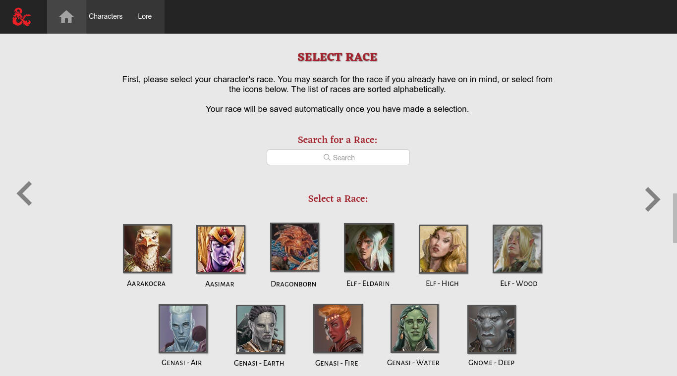
Screenshot of the race selection page.

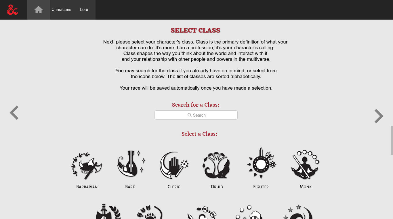
Screenshot of the class selection page.

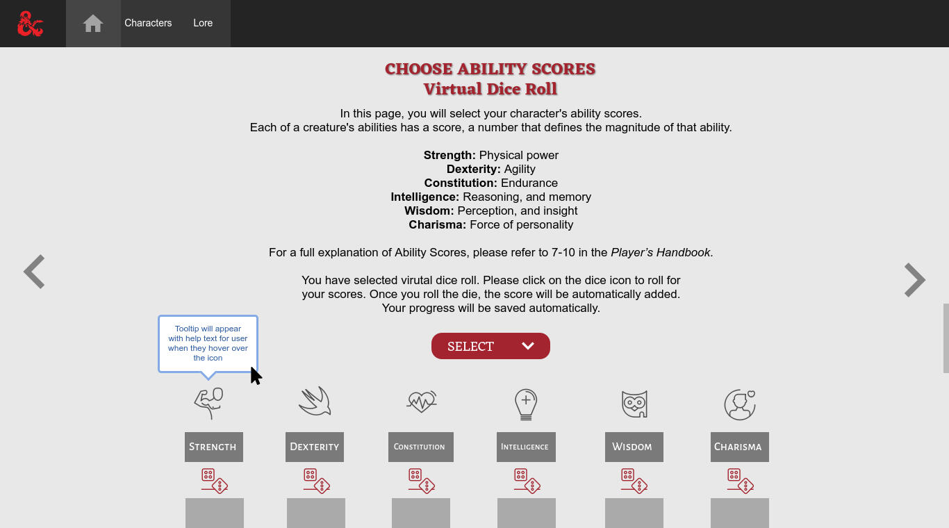
Screenshot of the virtual dice roll page.

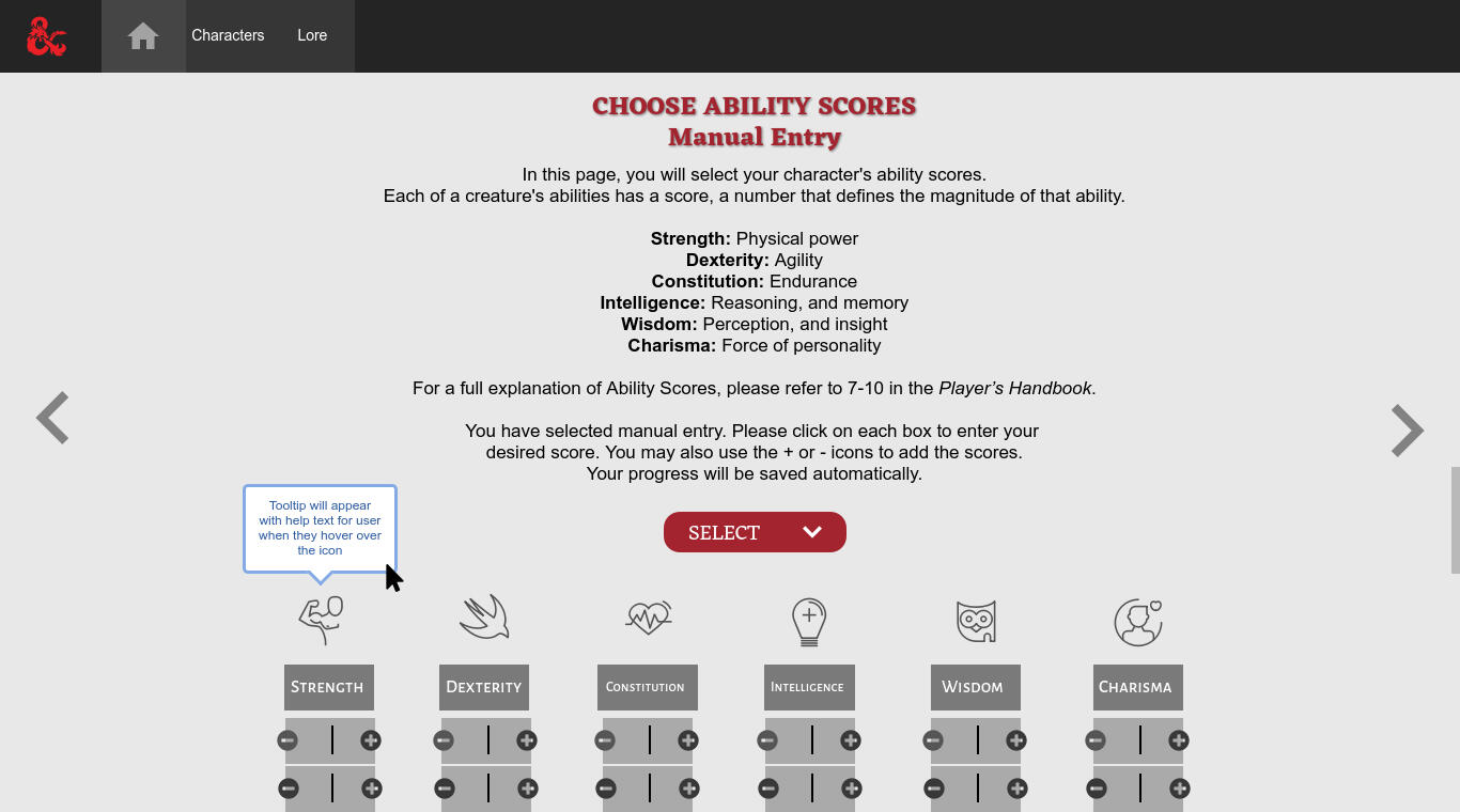
Screenshot of the manual entry page.
Context
Creating a character in a Dungeons and Dragons (D&D) campaign can be both enjoyable and challenging, especially for newcomers. Seasoned players may consult the player handbook for detailed character crafting, but beginners often struggle to set up their characters accurately.The process involves selecting a name, race, and class for the character. Players then roll dice to determine values for stats like "dexterity," "charisma," and "constitution." The dice type and quantity vary based on the character's race and class, posing a challenge for newcomers. Additionally, players must devise a character backstory, providing motivation to join a party and embark on quests.Considering these complexities, it's clear why new players find it challenging to swiftly integrate into a D&D session.Target users:
* New players seeking an intuitive and straightforward method for character creation.
* Dungeon Masters (DM) tasked with crafting a new character or aiding newcomers in character creation.
* Any regular player in need of creating a new character.
User Goals
"As a beginner, I want to create a custom character easily without having to know extensive D&D lore or rules""As a Dungeon Master, I want to help new players create a new custom character without spending too much time on calculating ability scores, and combing through the player handbook"
Process
Step 1: Interview
I interviewed three D&D players with varying experience levels to understand their use of online character builder tools. The goal was to assess ease of use and gather suggestions for improvement.All three players expressed dissatisfaction with existing tools, citing limited options, complexity in stat calculations, and specific frustrations with popular tools like "DnDBeyond".Despite its popularity, users found issues with inaccurate stat entries, difficulty in using the builder, and discontent with paywalls for extra character info. Additionally, all three players heavily relied on the Player’s Handbook for character creation, highlighting an extra step outside the app.
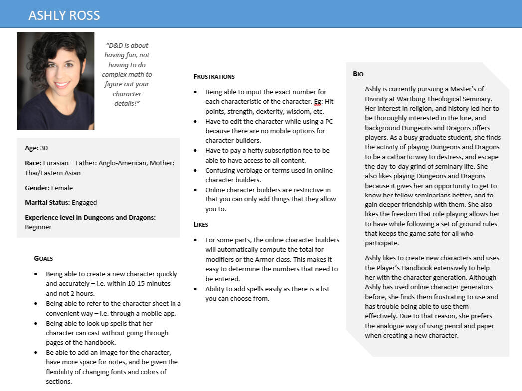
Step 2: Persona
Using the collected data, I crafted a persona to serve as a relatable reference for future design decisions.
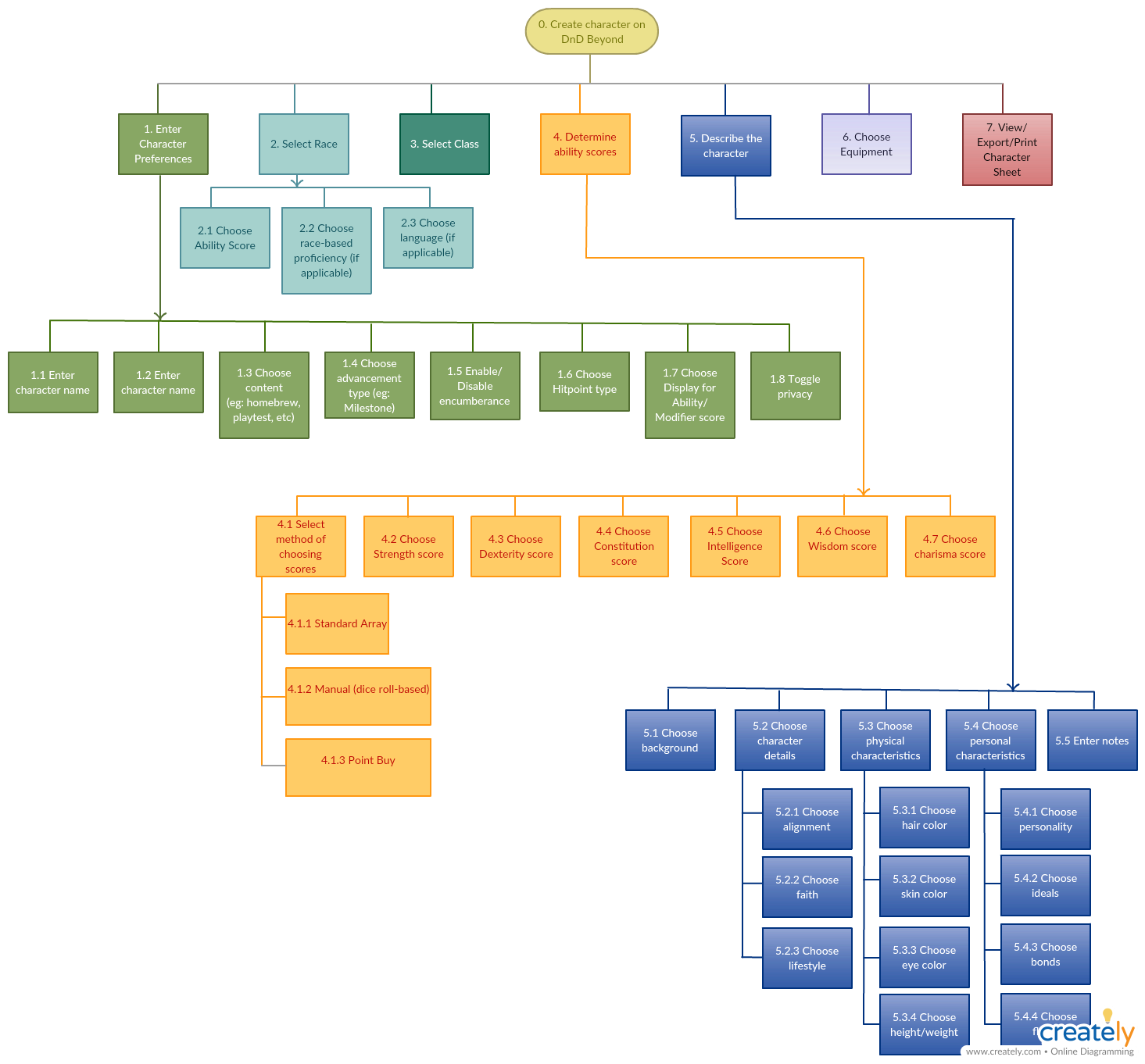
Step 3: Hierarchical Task Analysis (HTA)Following the persona creation, I conducted a Hierarchical Task Analysis (HTA) on DnDBeyond to understand the steps users take in creating a new character. The analysis revealed a substantial number of steps for basic functions like selecting a race and adding ability scores, excluding customization and additional features.The process on DnDBeyond enforces a linear progression, requiring users to complete all steps before moving forward, limiting the freedom to explore. It's important to note that this linear flow applies to new character creation, not during editing, where users have more flexibility.The process lacks comprehensive information at each step, offering only an initial paragraph explanation. Users would benefit from additional documentation, tooltips, and help throughout the process to enhance their understanding of the tool.
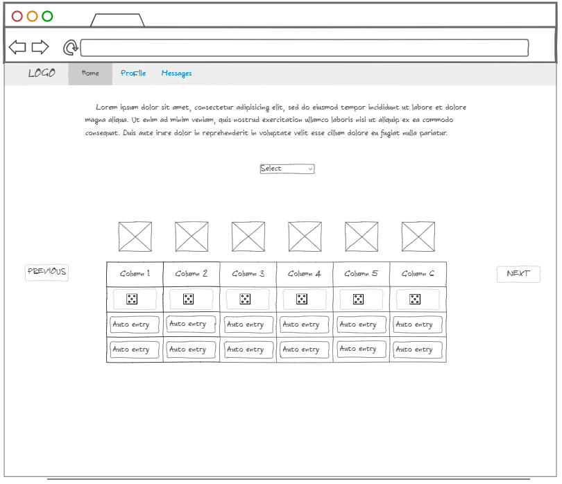
Step 4: Low Fidelity PrototypeNow, after understanding how users go through the character creation process, I created a design where, with just one click, you can get a random character. This is handy if you want to jump into the game quickly without spending a lot of time customizing.I designed a visually-oriented page where you can easily pick your character's race and class from avatars provided. You can quickly identify the class and race from just a glance of the images. The same approach was applied to the page for choosing character classes.To make it easier to add numbers and skills, I created two options:
First, you can type in the numbers manually, and the app will do the hard work of figuring out where each statistic (stat) should go based on their chosen race and class. This is beneficial for new players or those who don't want to do the math themselves.The second option involves virtual dice rolling to get your stats. The system will distribute the points as necessary. It's convenient, especially if you don't have real dice with you.

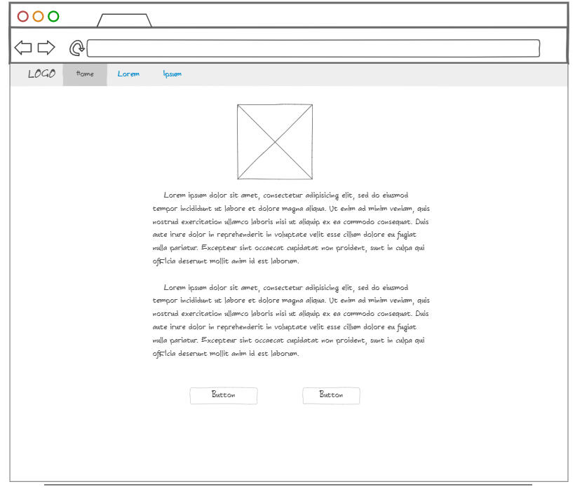
Low fi wireframe for the landing page of the app.

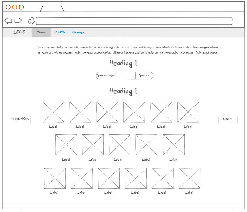
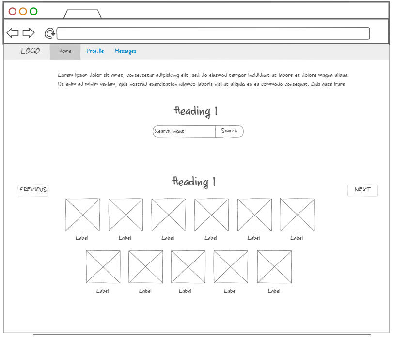
Low fi wireframe for the race selection page.

Low fi wireframe for the class selection page.

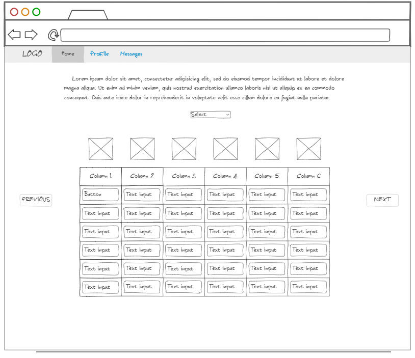
Low fi wireframe for the stats page.

Low fi wireframe for the virtual dicepage.
Step 5: Usability TestingOnce the prototype was ready, I moved on to Usability Testing. I chose three users to try out the design, providing them with a script for the test. As they walked through the design, I observed and encouraged them to share their thoughts.Actively seeking user feedback helped me understand their experience and gather valuable insights. This input became crucial for making improvements and advancing the prototype towards a high-fidelity version.Below is a screenshot displaying the results obtained from the usability test:
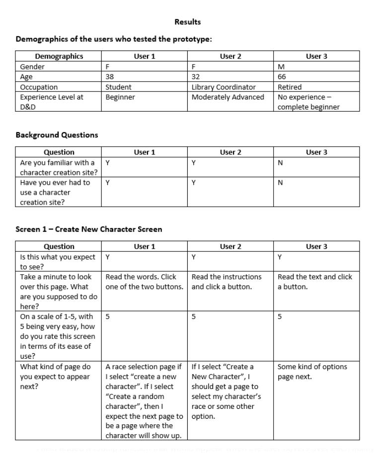
Step 6: Refined PrototypeAfter reviewing feedback from usability testing, I made some improvements to the prototype.Users found the page for adding abilities manually confusing due to the table format. To make it clearer, I redesigned the layout using columns for each ability score, reduced the number of rows, and added "+" and "-" icons for easier number entry. In the initial version, users could only type in the information.For better guidance, I introduced tooltips. Now, when users hover over each ability score, a tooltip appears with helpful information on using the icons and entering scores. This addition aims to make the process more straightforward for users.The prototype was built with proto.io.
What I Learned
Time constraint was a challenge for this project. Since there were so many steps that needed to be done, and only one person to complete all the tasks, I did find myself having to manage my time more effectively.
Although three participants were involved, having more would have been beneficial for gaining additional insights and identifying patterns in user behavior and needs.
Given that this project was part of an early class in my pursuit of a B.S. in Informatics, I recognize areas for improvement. In hindsight, I could have better prepared for user interviews and created more design iterations to enhance the overall project.
I gained a solid understanding of design thinking and learned practical skills, including the creation of both low-fidelity and high-fidelity wireframes to test design ideas.
The course exposed me to user research methods, particularly usability testing, and taught me how to conduct user interviews. Although initially nervous about speaking to users, I discovered that I could overcome my anxiety and effectively communicate with strangers. Learning to observe and actively listen to user feedback became instrumental in informing design decisions for the prototype.
ChurchConnect
This was a final project for a graduate-level class called "Design Methods for Prototyping". This project was completed in the Spring 2022 semester.
My Role
Primary contributor (solo project).
Summary
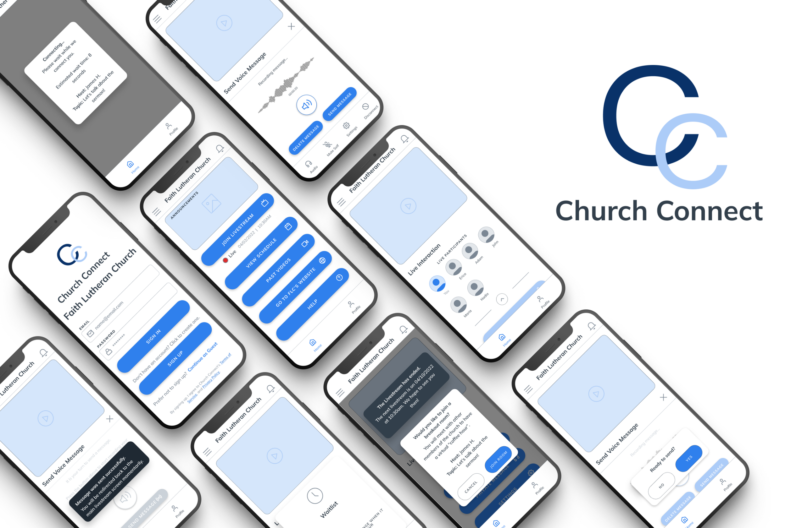
When COVID-19 hit the US, churches faced the challenge of conducting services without physical attendance. To adapt, many churches began using technology like video streaming and messaging to connect with their members, but not all churches were comfortable or proficient with these changes.ChurchConnect was created to help by connecting church-goers to online church streams, allow communication during streams, and provide updates all within one app.Outcome: As this was a class project and not a real project, the results of the research done based on testing with prototypes can be used as a proof of concept. People liked the prototype, and many wished it could become a real app they could use in the future.
Context
During the pandemic, church staff faced engagement challenges, and church-goers struggled with online worship streams (and/or technology). The project started with the question, "How can we make the online worship experience better for congregation members to increase their engagement during the pandemic?"As the project progressed, the focus shifted to address the shared problem of low engagement. Staff worried about attendance, and attendees found online streaming passive, hindering connection with worship leaders.Recognizing that the pandemic was lasting longer, most churches agreed that future worship services would involve both in-person and online sessions at the same time, with online being the only option during quarantine.Target users
* Church-goers looking to take part in online worship services
* Individuals exploring churches for the first time but feeling unsure about attending in person
* Those who are unwell, elderly, homebound, or have disabilities
Note: Since this is an end-to-end project and one for an entirely new product, I had used multiple usability testing heuristics to complete the project. In a real world scenario, where it's unlikely that I would complete a project end-to-end, I would pare down the amount of research instead and focus on how to get the data I need while being scrappy and quick. For a class project, I had the luxury of doing each step fully before moving on.
User Goals
"As a regular church attendee, I want to be able to join church service despite being in a lockdown. I want to be able to engage with the other attendees and the pastor while viewing the online service""As a church-goer, I want to be able to still socialize with others while we're all physically apart. I want to do this in the context of a church worship service."
Process
Initial Idea
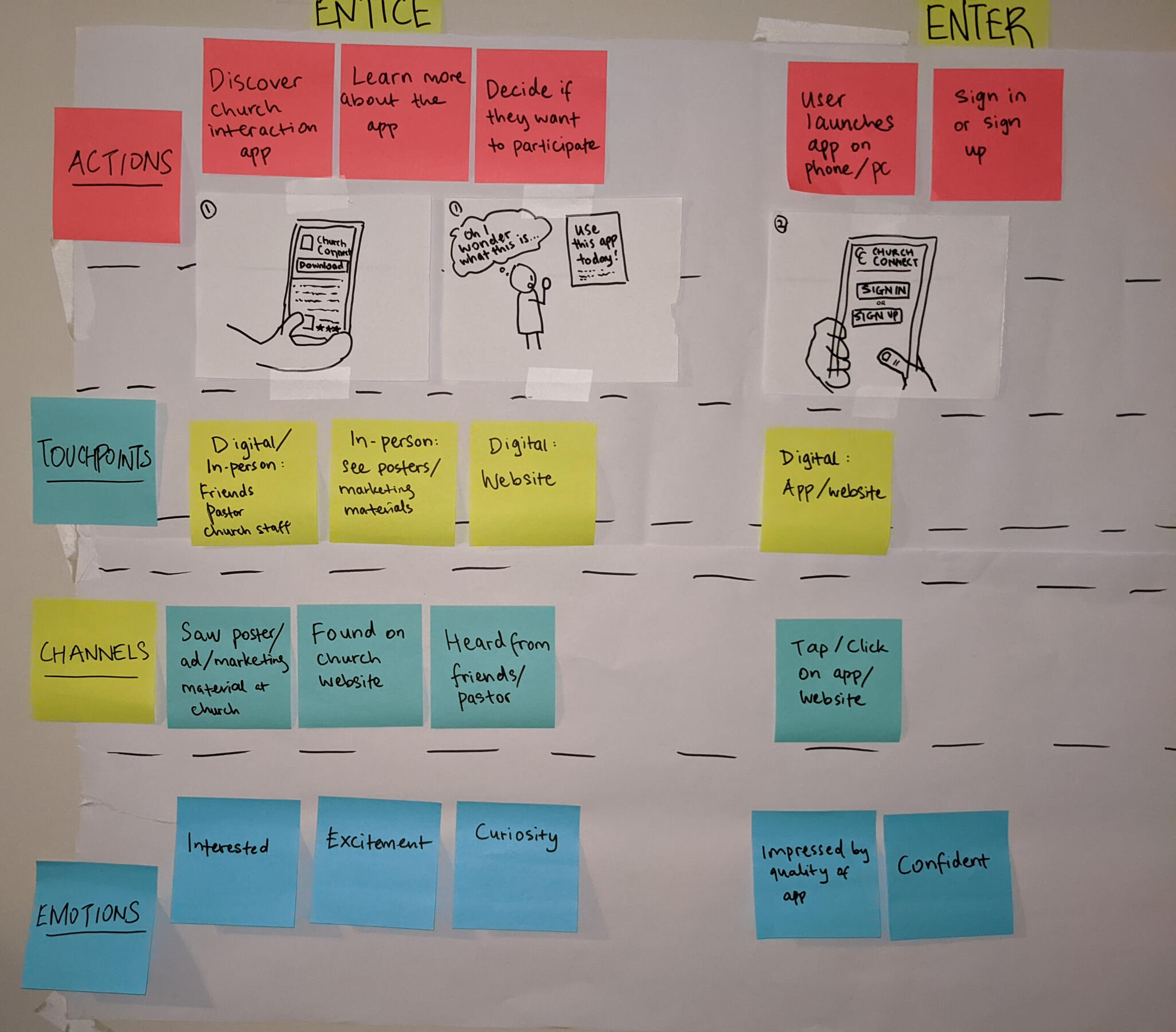
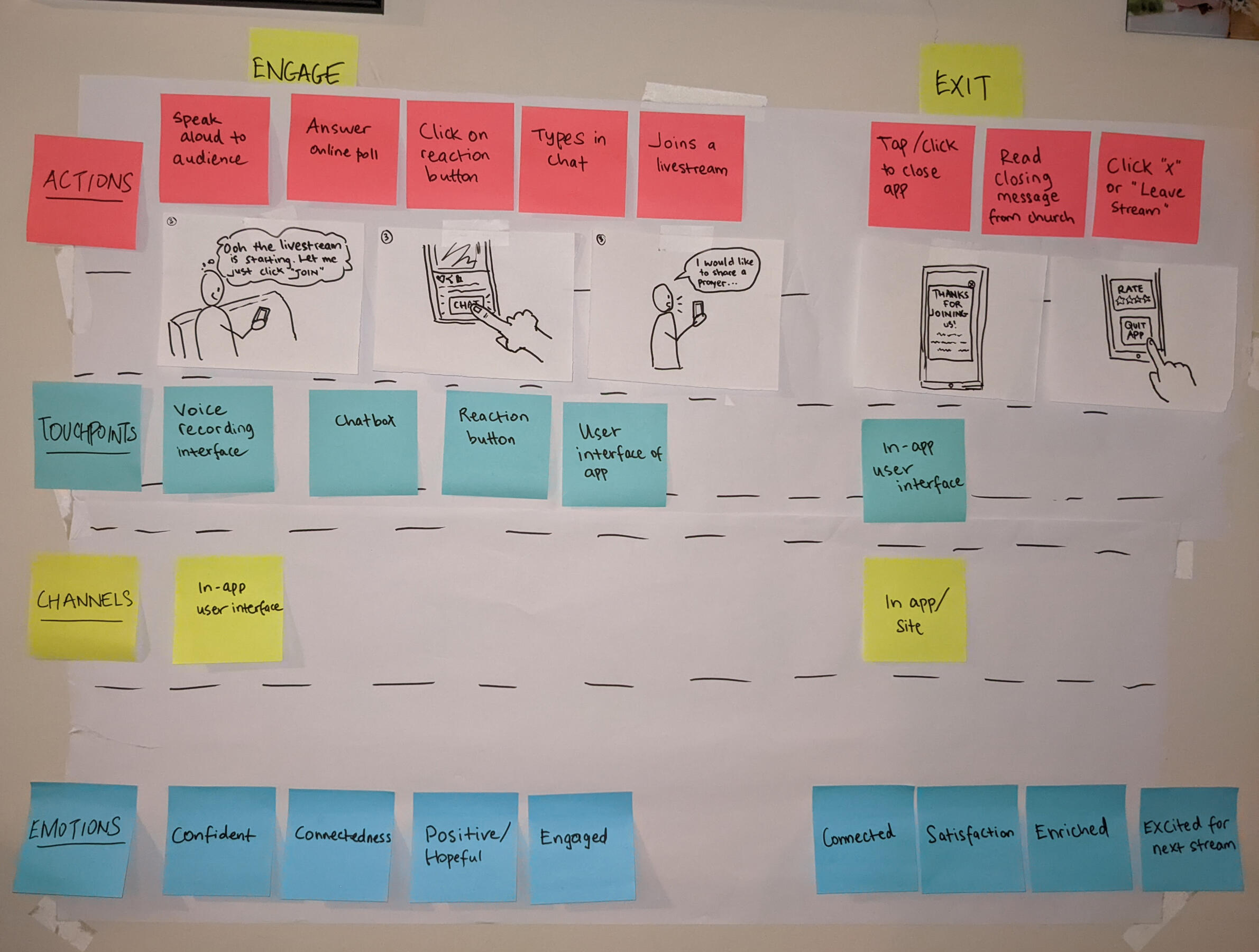
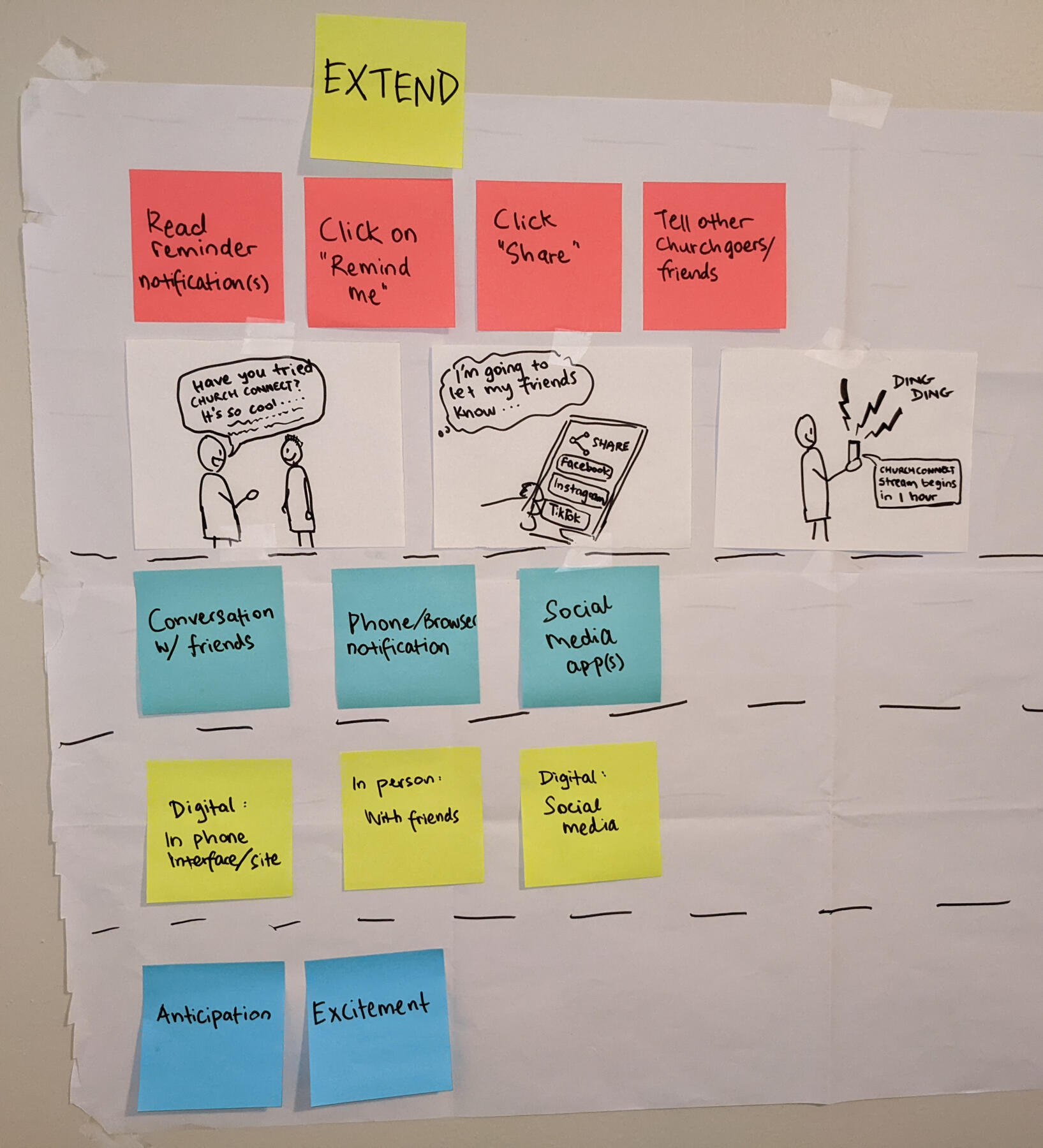
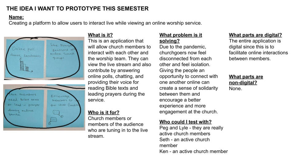
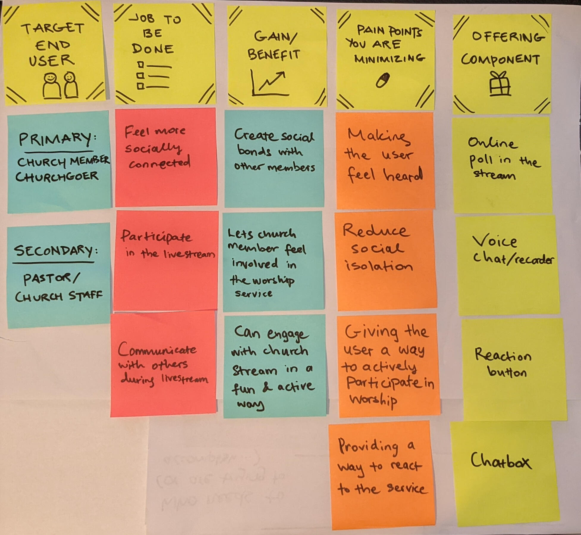
In the early stages, I used Post-It Notes, sketch paper, butcher paper, and gel pen or marker to sketch out ideas, map a future experience storyboard, create the value proposition of the project, and draw early prototype concepts. I used the "How might we" brainstorming technique to identify the problem and generate as many ideas as possible for potential solutions. This exercise was particularly helpful as I was able to do a brain dump and then later sort out the valuable insights from the "noise".I showed the value proposition statements that I had made to some potential users, and was able to validate their understanding of the project, and get a buy-in from them in terms of their interest in seeing a product like this come to life.

Early storyboarding concept: Entice and Enter Stages

Early storyboarding concept: Engage and Exit Stages.

Early storyboarding concept: Extend Stage.

Summary of Ideas and Storyboarding.

Value Proposition of the project.
User Workflow Sketches and Early Wireframing
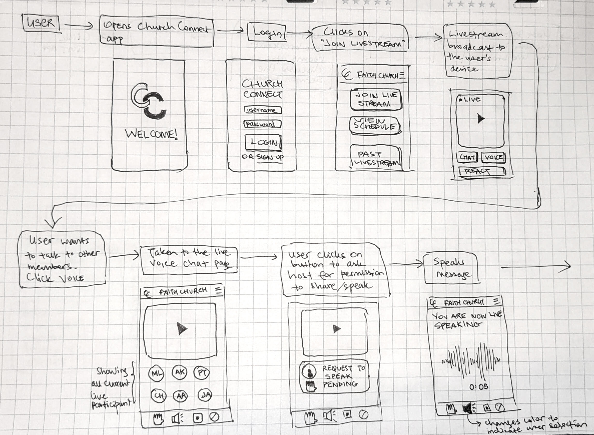
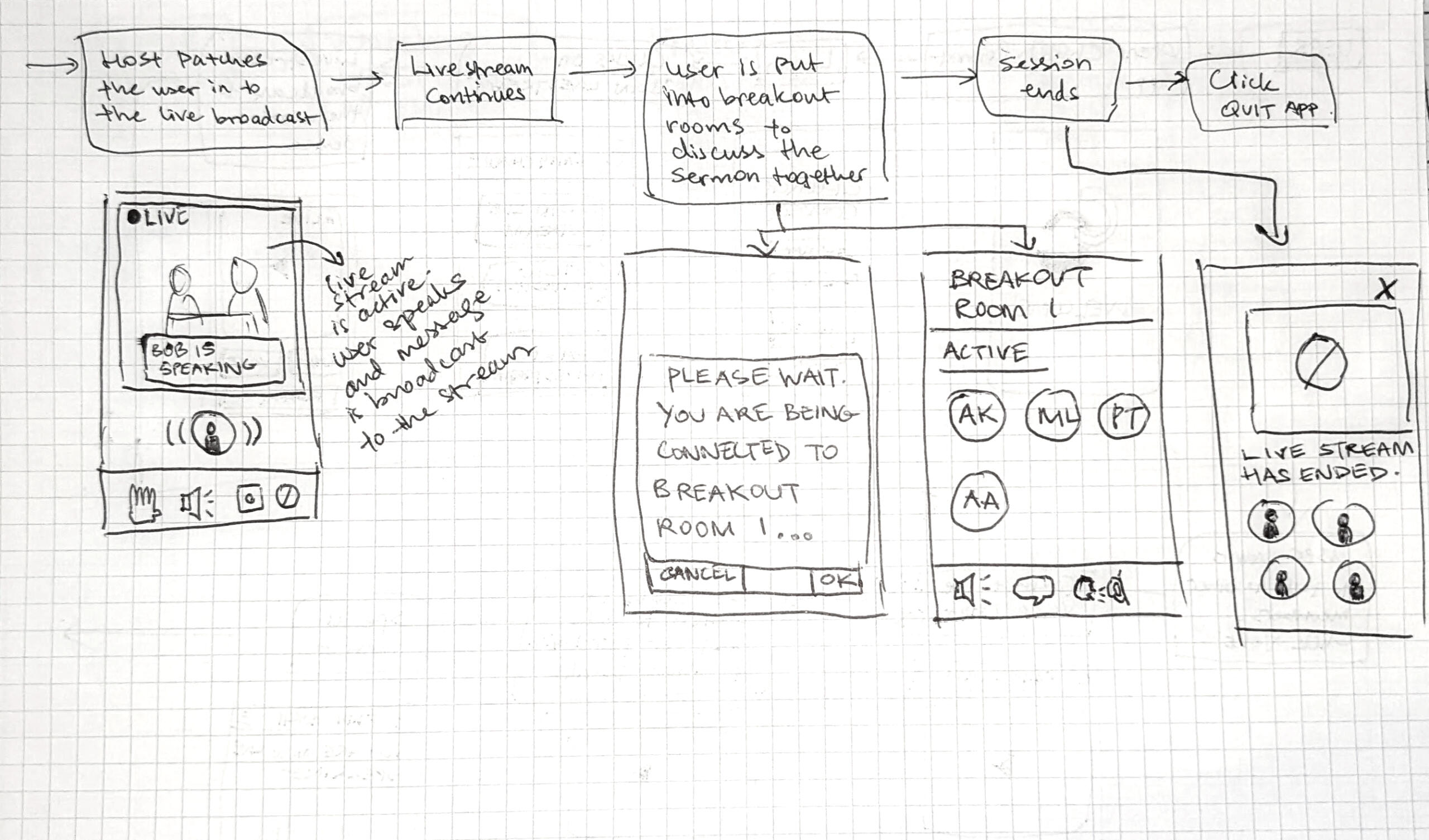
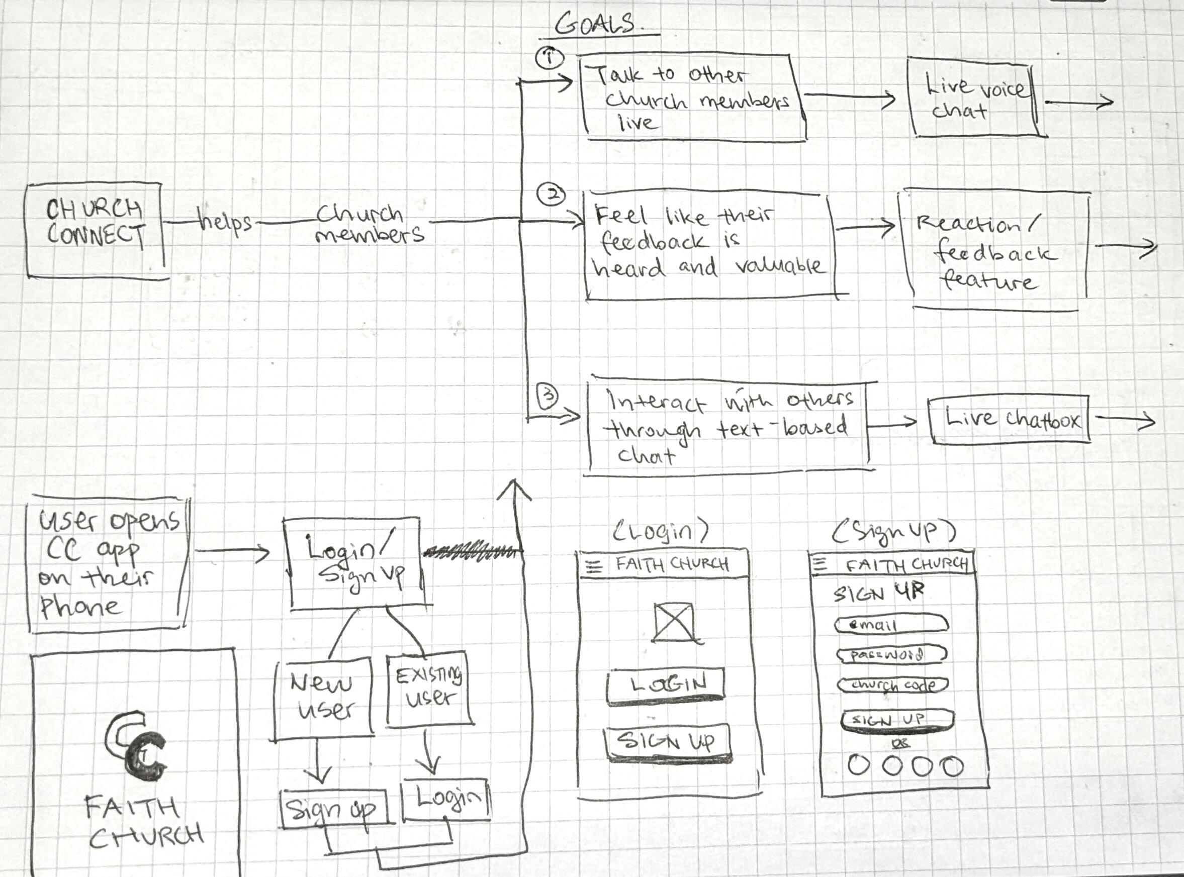
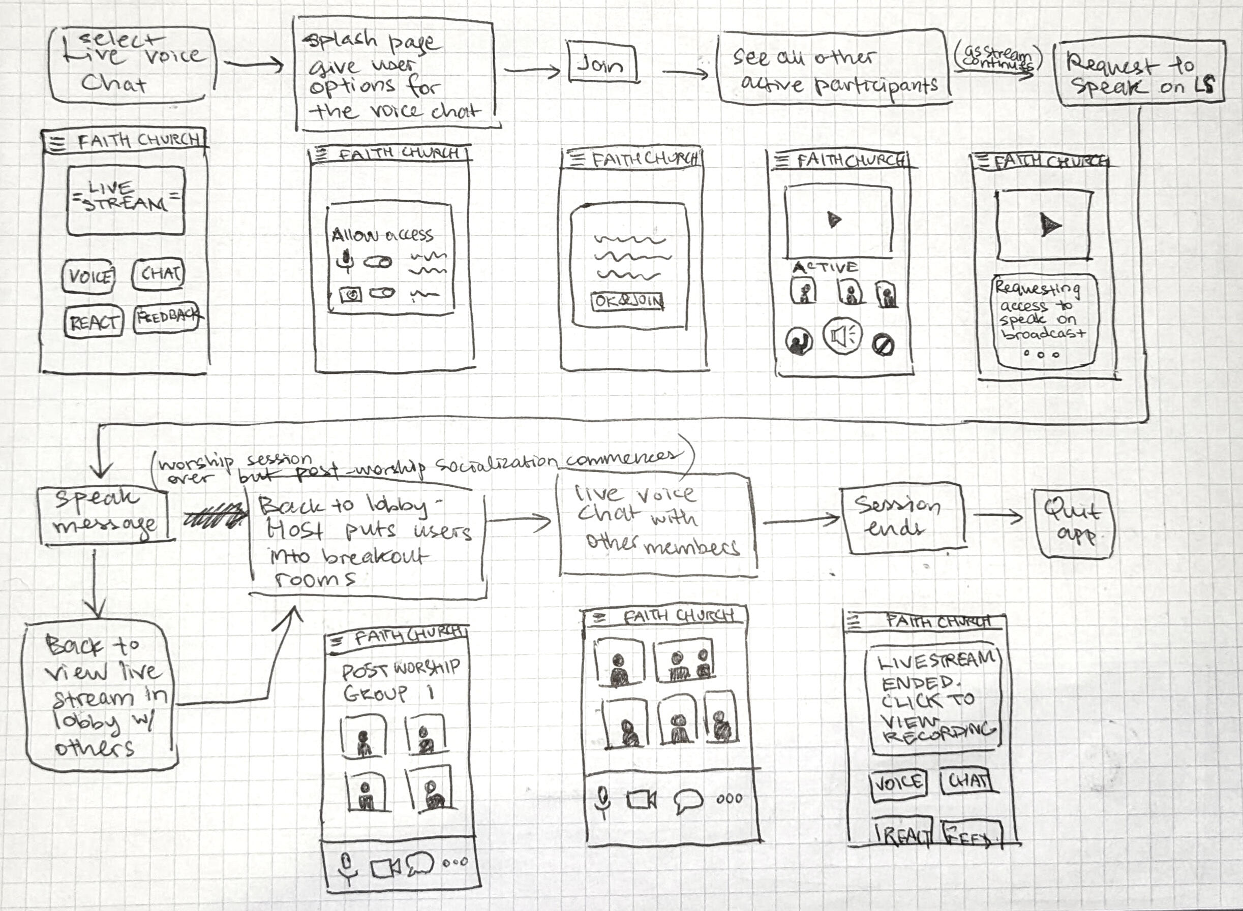
As my ideas evolved, I began sketching a potential prototype for the app, tentatively named "ChurchConnect." In this phase, I outlined the user workflow steps and explored screen layouts based on these steps. I had multiple iterations of these sketches which allowed me to refine the concept and explore different configurations.Below are some sketches from this exercise.

User workflow from beginning - Part 1.

User workflow from beginning - Part 2.

User workflow to request live voice chat - Part 1.

User workflow to request live voice chat - Part 2.
Paper Prototype: Iteration 1
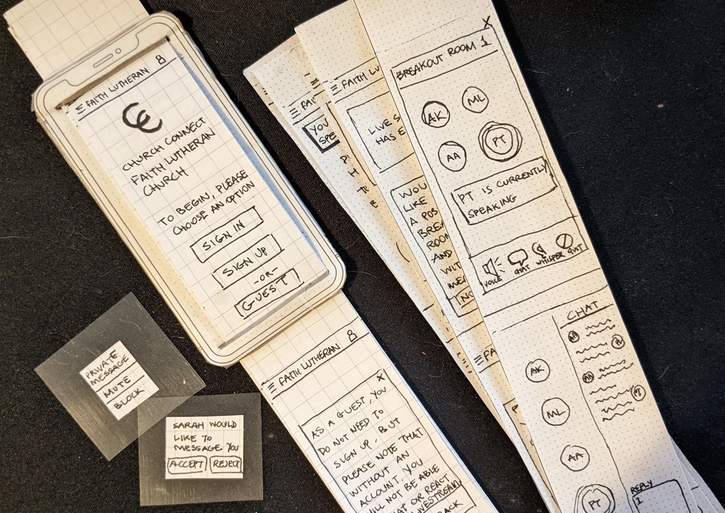
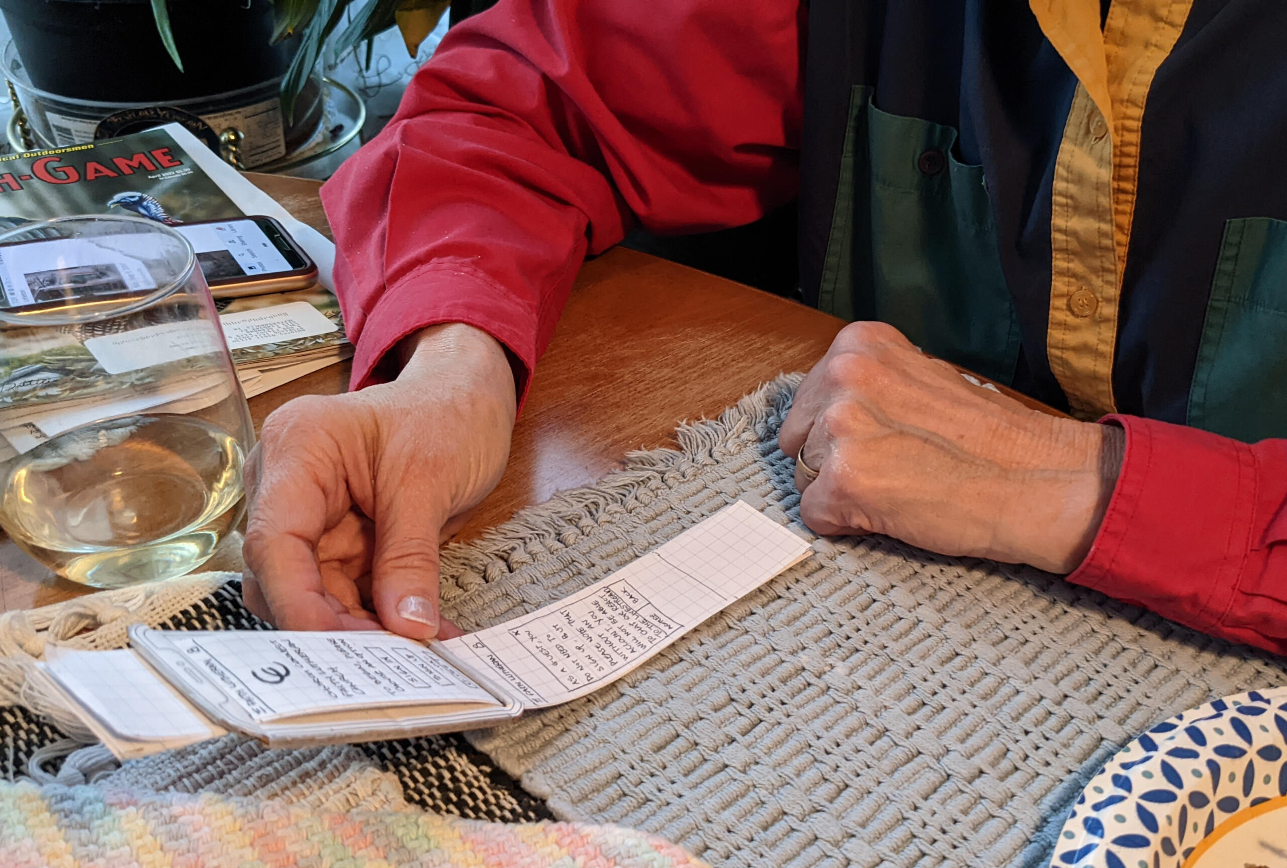
After finalizing the workflow steps and styling, I proceeded to create a paper prototype using graph paper and cardboard. The purpose of this paper prototype was to present early concepts to potential users and test the assumptions and design decisions I had made.

Paper prototype: Iteration 1.
Validation of Paper Prototype
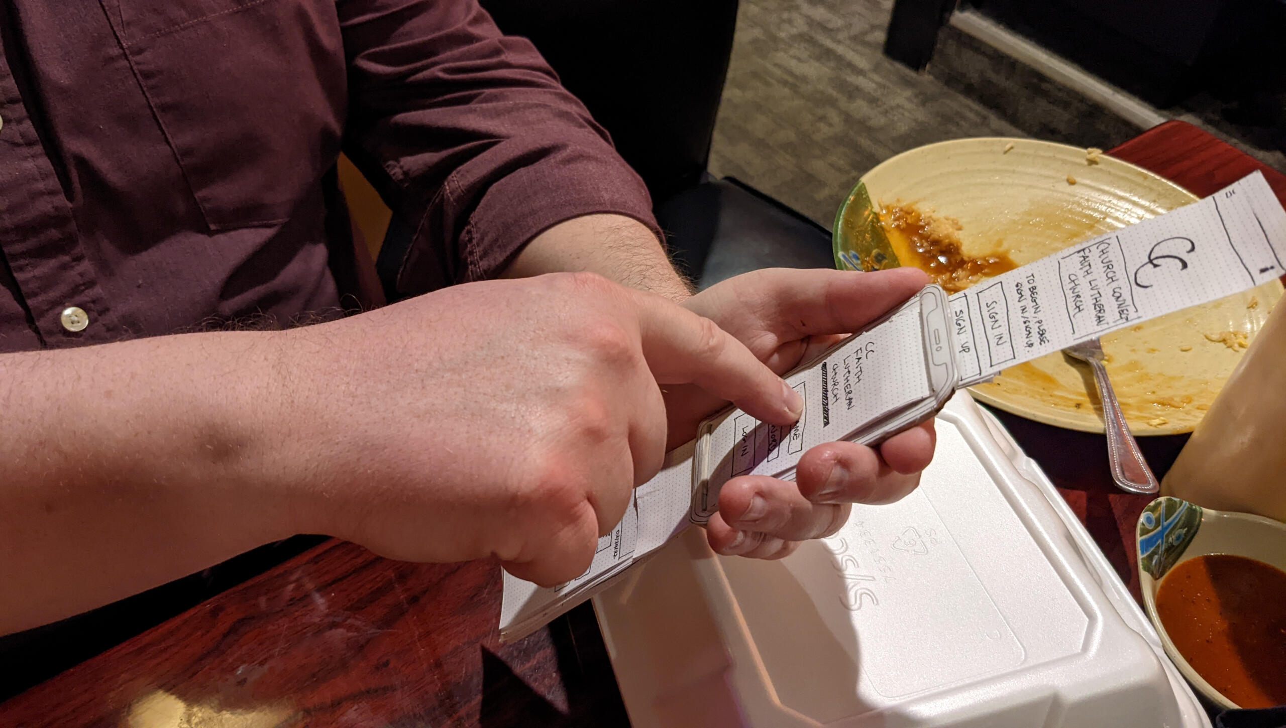
I decided on a combination of an interview and a think-aloud protocol to get the user data that I needed. Using the think-aloud protocol, I assigned three tasks for the user to perform with the paper prototype, encouraging them to vocalize their thoughts as they progressed through the steps.An example of a task that I had administered is as follows:
Task 1: You see the first screen (login screen). How would you access the features in the app?I then conducted the interview/think-aloud protocol on 2 different participants.

User 1 testing the paper prototype of "ChurchConnect" over dinner.
Data Analysis
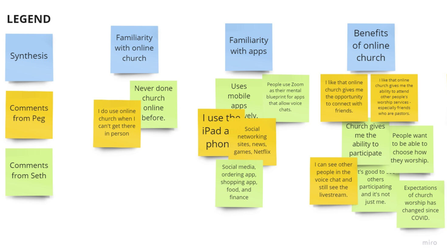
After conducting the think-aloud-protocol and interview, I compiled the information using Miro. Using the affinity diagramming technique, I grouped up thoughts and the users' answers into similar groups and analyzed them. Here is an example page from the affinity diagram exercise.

A screenshot of the data from the affinity diagram exercise.
Paper Prototype: Iteration 2
After the first round of interviews and think-aloud protocols, I made some modifications on the design based on the feedback that I had received from the users and created a second iteration of the paper prototype.The changes that I had made were in the layout of the buttons, the clarity of the terms used for the buttons, and some additional elements like adding confirmation dialogue boxes.

User 1 testing the second iteration of the paper prototype of "ChurchConnect".
Digital Prototype: Iteration 1
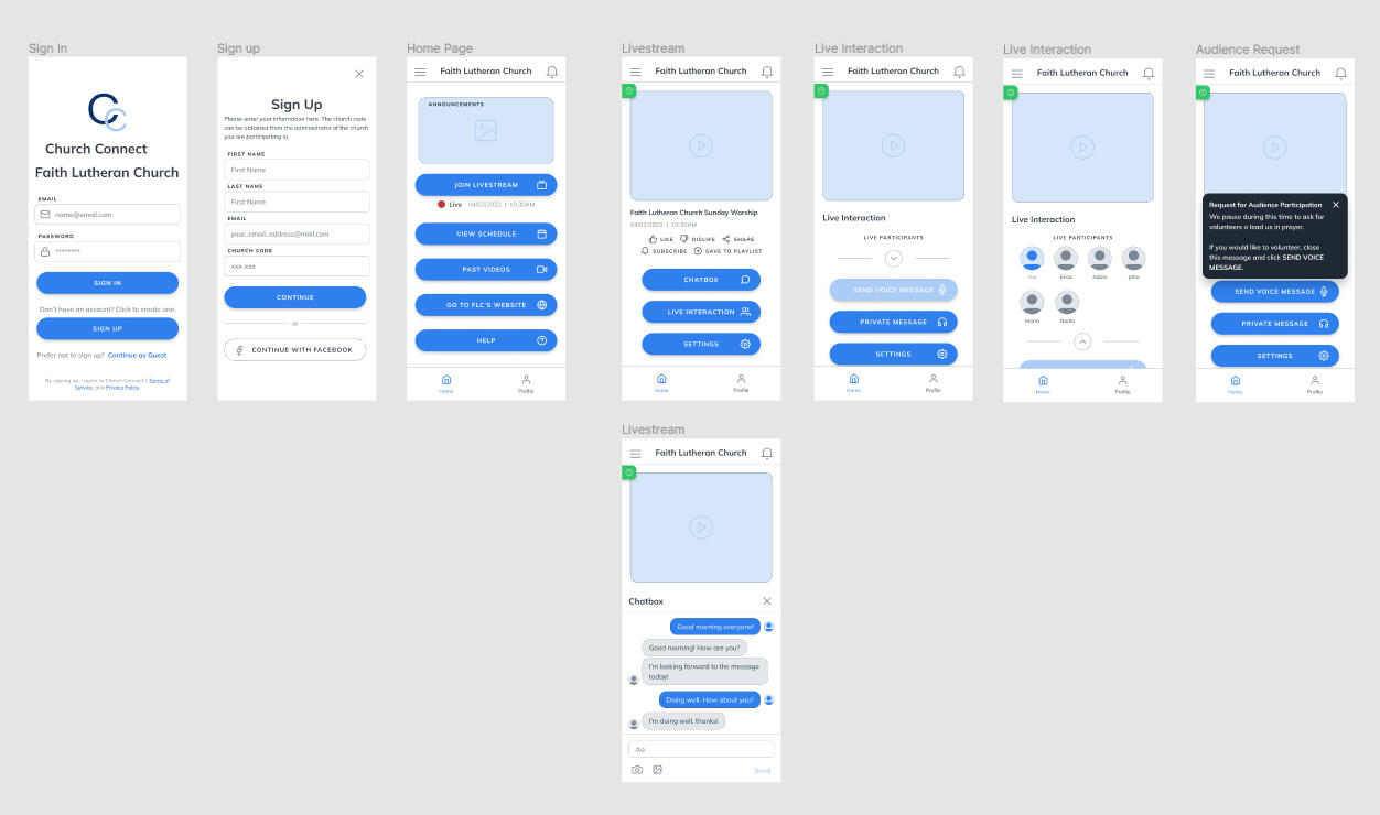
Using the insights gathered from the second round of interviews and think-aloud protocols, I refined the design and developed a third iteration of the prototype digitally using Figma. This prototype incorporated interactivity to simulate the actual app's functionality.To validate the design, I ran a third research session - again using the interview and think-aloud protocols. I had a completely new user, and one returning user for the test during this session. The new user, an older gentleman who identified as not very "tech-savvy," was intentionally chosen to assess the app's usability for individuals less familiar with technology. This approach aligned with my commitment to inclusive design, ensuring the app's usability for users with varying levels of tech experience.
Promotional Website
The final steps for this process were for me to create a message map and storyboard to outline how I would present the concept of this app to other people. I had initially decided on presenting the information through a PowerPoint slide but after some consideration, I opted to build a promotional website instead. I wanted my app to look and feel like it’s a “real” product.The website can be accessed here:
ChurchConnect

Digital low-fidelity prototype of ChurchConnect.
What I Learned
The success of a project depends heavily on effective preparation, including requirements gathering and user feedback. Managing both the project and solo-designing posed challenges, highlighting the significant impact of a skilled Project Manager.
User experience with ChurchConnect is tied to their electronic device familiarity. Testing with a user less versed in newer technology and unfamiliar with smartphone usage patterns was insightful, guiding adjustments for inclusivity and accessibility.
Balancing privacy with user adoption, requiring sign-in enhances security but may hinder adoption. A "Guest" mode addresses this, enabling users to enjoy features without signing up.
The project emphasized the importance of recognizing that designers are not the users. preventing biased design decisions. Fortunately, I had access to potential users, allowing for validation of the design and suggested more effective alternatives.
About
Hello! I'm Jules Ackleow (she/they). I originally hail from Malaysia but have called the United States home since 2012, becoming a naturalized citizen in 2019. My diverse background, shaped by my cultural experiences, plays a significant role in influencing my design decisions.Being an active member of the LGBTQIA+ community locally and within the church where my spouse serves, Diversity, Equity & Inclusion (DE&I) holds great importance to me. I'm passionate about dedicating my time and efforts to these causes.Beyond my design work, I proudly declare myself a nerd-geek. When I'm not brainstorming solutions for user problems and crafting user interfaces, you can find me engrossed in nerdy pursuits, whether it's playing video games like Mass Effect and Destiny 2, delving into science fiction, non-fiction, or horror books, watching Doctor Who, exploring the Marvel Cinematic Universe, or expressing my creativity through drawing and painting on Procreate or traditional media. In between, I enjoy creating crafts or miniatures with my spouse and lavishing attention on my three adorable dogs (because you know, they're always so neglected - that's what they'll try to convince you of).
Thank you
Candidate Messaging: Visual Redesign
This was a visual redesign project for a feature called "Candidate Messaging" for the Jobvite suite of apps. August 2023 - Present. (The feature has been released as General Access but is still active in the Development teams' sprints for any additional work as necessary).
My Role
Primary individual contributor, part of a multidisciplinary team.
Summary
A few years ago, Jobvite introduced a feature called "Candidate Messaging", enabling candidates and recruiters to communicate via text.In August 2023, my task was to revamp the branding and streamline workflows for a better user experience. The primary objective was to align the "Candidate Messaging" interface with the overall product design (for the Jobvite suite of hiring apps), reducing user dissonance and facilitating cohesive demonstrations by customer-oriented teams like Sales and Implementation.

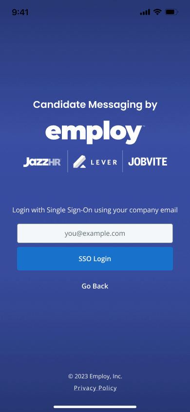
Splash Page for the Intelligent Messaging in-app widget.

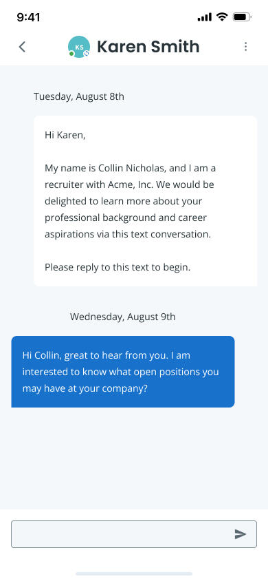
Candidate and Recruiter chat screen.
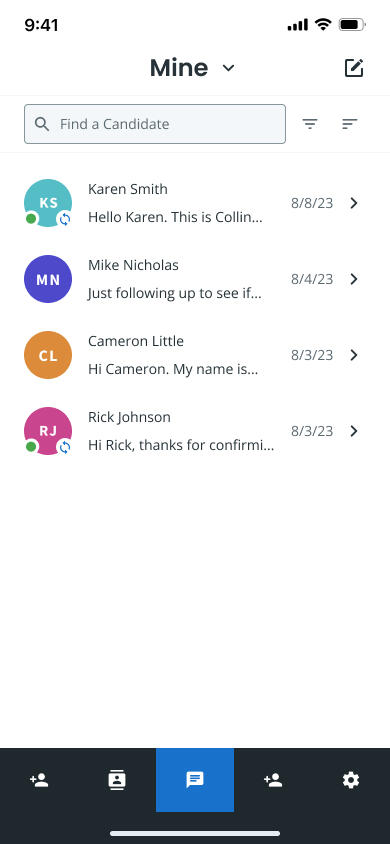
List of Messages for the recruiter.
Context
Note: To avoid any potential confusion, it's important to mention that Jobvite has acquired various entities over the last two years. The consolidated group of business units is now referred to as "Employ." Despite operating under the Employ branding, the specific product housing this feature retains the name Jobvite. This is why the splash page has the logo "Candidate Messaging by Employ".
When initially launched in 2019, the Candidate Messaging app was exclusive to customers with the relationship management product. However, it has since evolved into a brand-wide product, especially after the acquisition and merger into a cohesive brand called "Employ". Given this shift, a visual refresh aligning with current branding and visuals became imperative. The Candidate Messaging product includes a Chrome extension, an in-app widget, and a mobile app, all of which required a visual redesign.The Candidate Messaging app facilitates recruiters and hiring managers in texting candidates, discussing job offers, scheduling interviews, and more—all from their smartphones. This convenience is especially beneficial today where we live in a world where most people own smartphones; This streamlines communication for both the hiring party and candidates.The redesign was done for both the mobile version and the Chrome extension version.
User Goals
"As a user, I want the Candidate Messaging feature to blend seamlessly with the rest of the app, as it would be confusing if the feature looks distinct"."As an Account Manager/Business Development Representative, I need to present the Candidate Messaging feature as an integral part of the comprehensive Jobvite product suite. A smooth and integrated presentation during sales pitches to potential customers is crucial for obtaining their buy-in".
Process
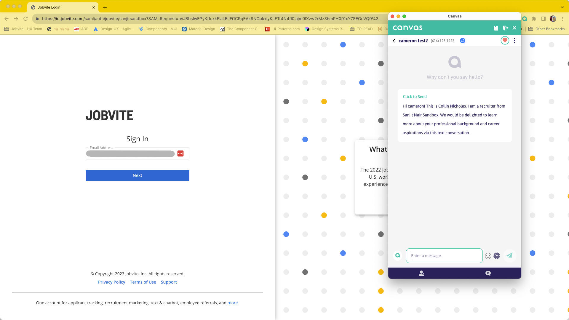
I started the project with a heuristic evaluation of the feature as it had existed then. I simulated the user experience by creating dummy candidate profiles and testing it as a recruiter within the Jobvite test environment. Through the evaluation, I managed to find user patterns and potential pain points, which guided me on which screens required significant redesign and which ones needed minor adjustments. I also obtained the branding guide from the Marketing team to ensure consistency with our app's look and feel.Here are some screenshots of what the app looked like before the redesign.

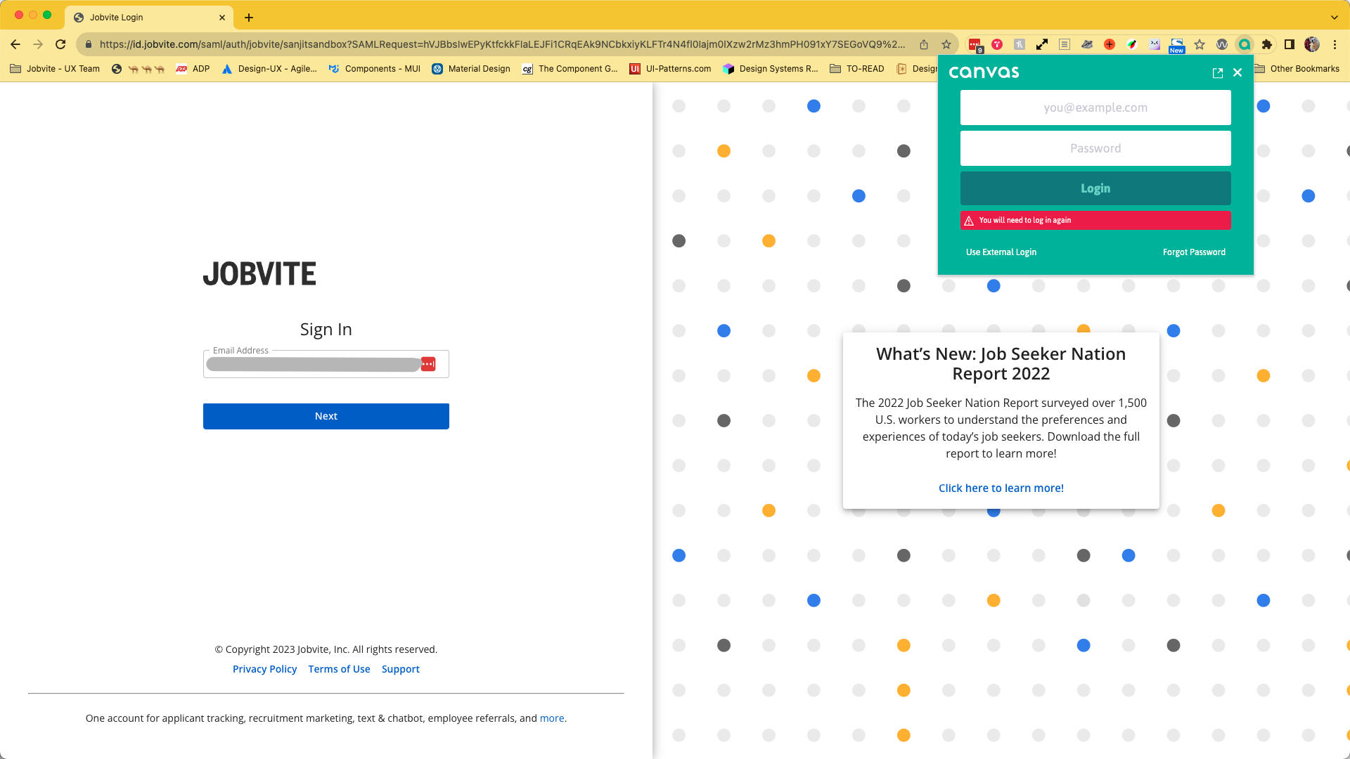
Login screen for the candidate messaging app. This instance was accessed via Chrome extension.

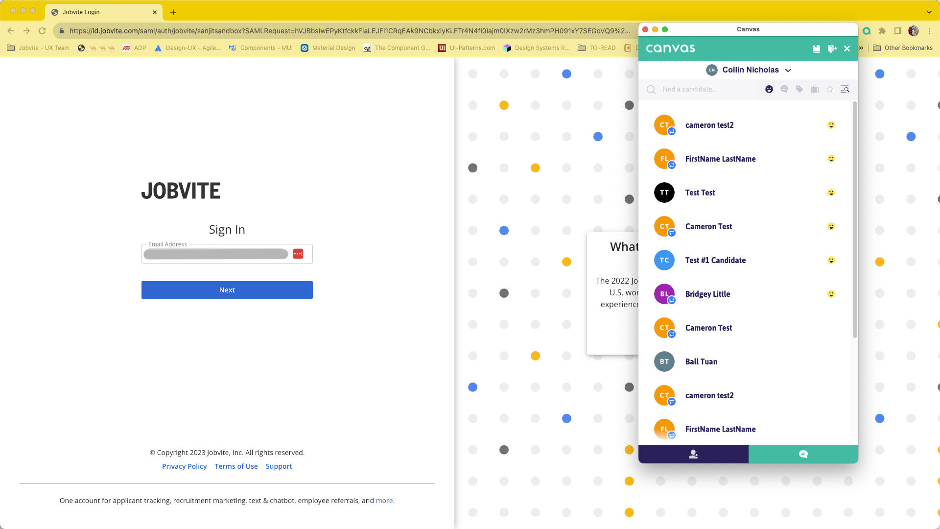
This is the candidate's list, with smiley faces denoting that the candidates are new to the system.

This is the chat screen that the recruiter/hiring manager uses to contact candidates. Note that it looks similar to most text messaging apps in the market.

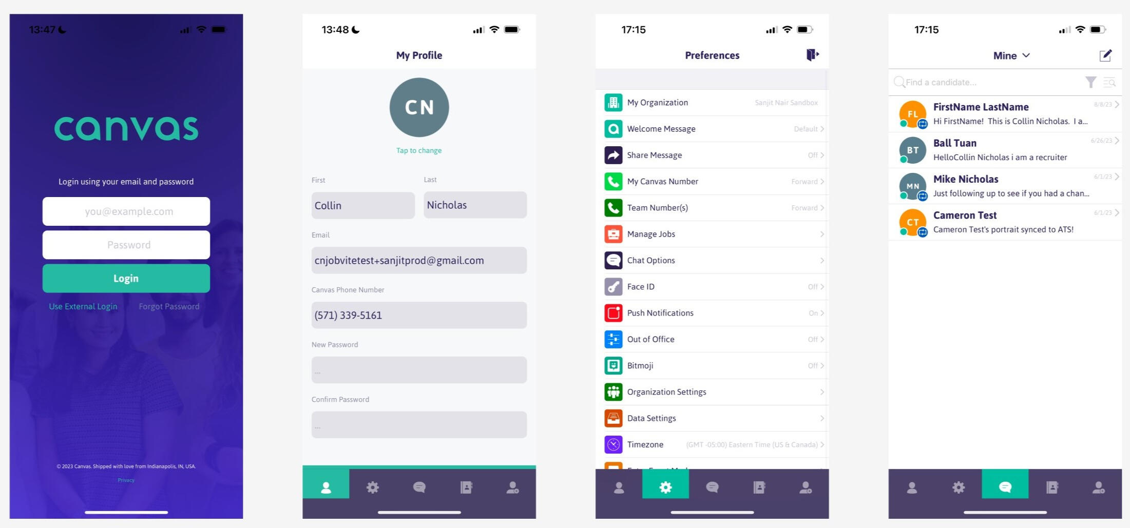
Some screenshots of the old screens for the mobile version.
Consulted the Marketing (Brand) Team on Branding Requirements
After gathering the information from the analysis, I consulted the Marketing (Brand) team to get the requirements and assets like logos and images.
Design Iterations and Mocks
From what I had learned through my heuristic analysis, I translated the results into making changes to the current screens. I created mocks of the relevant screens and went through iterations of the design. Once the UX team was satisfied with the improvements, the mocks were handed over to the engineering team.
What I Learned
A more cohesive look and consistent usability leads to better engagement from the users.
The internal Sales team was able to use the redesigned version to sell the product better. The Customer Enablement team was able to resolve customer issues quicker. Having a cohesive app meant that the internal teams can leverage the changes to help increase revenue for the business.

